Veloura
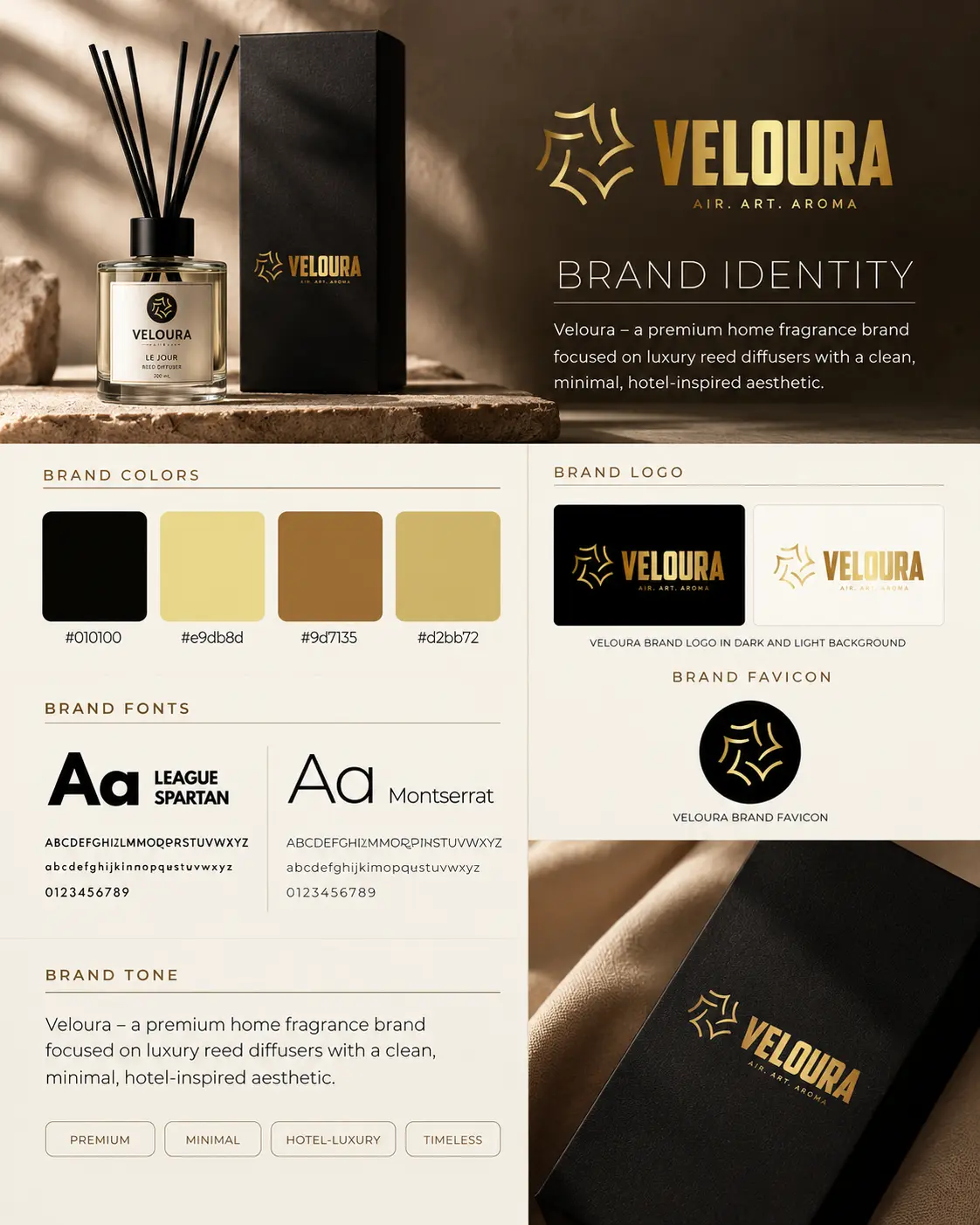
Brand Identity · PackagingFrom a private-label fragrance ambition to product samples the client approved.
E8 Digital · Graphic Design & Creative Strategy
I'm Mira, and I help founders see the brand they keep picturing in their head. Identities, packaging and digital spaces that feel like you, only sharper.
01 · The Thinking
Every colour, font and layout choice changes how people receive your message. So before I open any design tool, I get clear on what needs to be said, who needs to hear it and what the design should do for you.
We get honest about what you are really trying to say.
That message becomes a look and feel that is unmistakably yours.
Then every choice, big and small, earns its place.
02 · The Work
Beauty brands, luxury jewellery, travel guides and more. Each one started with someone trusting me with something that mattered to them.
From a private-label fragrance ambition to product samples the client approved.
Redesign of a brand presentation cover, with the reasoning behind each change.
Magazine cover built on a bold serif masthead and layered cover lines.
Luxury event flyer for a beauty business masterclass in Lagos.
Corporate summit flyer with an energetic, forward-leaning layout.
A beauty founder's vision, made visible through packaging and the details that surround it.
A digital setting designed to reflect the elegance of a luxury jewellery collection.
One recognizable identity, carried from the first impression to the details of a gift.
An Earlier Chapter
An editorial journey through Bosnia, Kuala Lumpur, Marrakech and London, with a more recent London edition.
Self-initiated packaging study: calm typography with one confident line of colour.
Self-initiated identity system across stationery and stickers.
Self-initiated poster series where the headline does the heavy lifting.
Self-initiated store design across desktop and mobile.
03 · The Story Behind the Work
Brand Identity · Packaging
Veloura started with a client based in Spain who wanted to build a private-label fragrance business, beginning with reed diffusers. My job was bigger than a pretty logo. It was about helping that ambition feel real.
Alongside the black, champagne and gold identity, I researched suppliers in Spain, reached out to companies and coordinated the packaging conversations. The design tied the diffuser, its box and the stationery together while the supplier talks moved toward samples.
The client received samples they loved and approved, then placed an additional order as they got ready to start selling. I shared guidance on the next steps too. Watching a business idea take physical shape? That is the part of this work that never gets old.
Editorial Redesign · Before & After
The original cover had big empty areas, a title sitting too low and a logo and palette that were not really part of the design.
Bring the original Veloura logo and tagline back in and lean on the existing black, champagne and bronze palette.
Stronger hierarchy, consistent margins and a numbered contents list. The rule was simple: show the brand first, then walk the reader through the content.
Beauty Identity · Packaging
A client based in the United States came to me picturing their own private-label cosmetics brand. My job was to make that picture visible. Cherie's Collection needed a presence that felt considered, not a pile of unrelated pieces.
I built the packaging and supporting brand assets around burgundy, a light-yellow interior and a repeating CR monogram. From product packaging to the business card and thank-you note, every piece speaks the same visual language.
The client loved the creative work and was looking forward to the next steps. The real win was giving the beauty brand in their head a clear, tangible form.
Luxury Jewellery · E-commerce
How jewellery is discovered online shapes how it is perceived. For Lumiere Collection, I worked with a client based in Ireland to design a luxury e-commerce experience that would match the elegance of the pieces, not just display them.
Layout, product presentation and visual hierarchy were considered together, giving the jewellery room to command attention. The website design shown here carries that feeling across desktop and mobile, alongside the brand visual that set the tone.
The client loved the luxury direction and was considering further creative strategy collaboration once advertising activities began. That appreciation opened a conversation about how the same thinking could stretch beyond the website.
Brand Identity · Visual Systems
An Earlier Chapter
Arezia Beauty Elite was one of my first real design projects, created for a beauty brand owner based in Malta. It is an early chapter in my journey, and I am proud of it, because real client work is what shaped my experience.
The identity work connected all the places a customer might meet the brand, from the first logo or website visual to the materials that accompany a purchase.
My contribution covered the logo, website visuals, banner, business card, thank-you card, gift packaging and supporting assets. Together, those touchpoints give a brand a recognizable presence instead of letting each piece speak alone.
I keep this work here as an honest look back at where I started. It has its own place in the portfolio, right alongside the projects that came after as my experience grew.
Editorial · Travel
A good tourist guide lets you imagine a place before you arrive and helps you find your way once you do. Commissioned by a client based in the United Kingdom, I designed guide magazines for Bosnia, Kuala Lumpur, Marrakech and London with that balance of discovery and navigation in mind.
The Bosnia, Kuala Lumpur and Marrakech editions belong to an earlier stage of my editorial work. The London edition is more recent, with its own distinct visual treatment. Together they show how I adapt editorial design across destinations and across stages of my practice.
Typography, layout, imagery and information hierarchy all work together to shape the reading experience. The goal is never just to fit information on a spread. It is to give it a rhythm that makes exploring a destination feel natural.
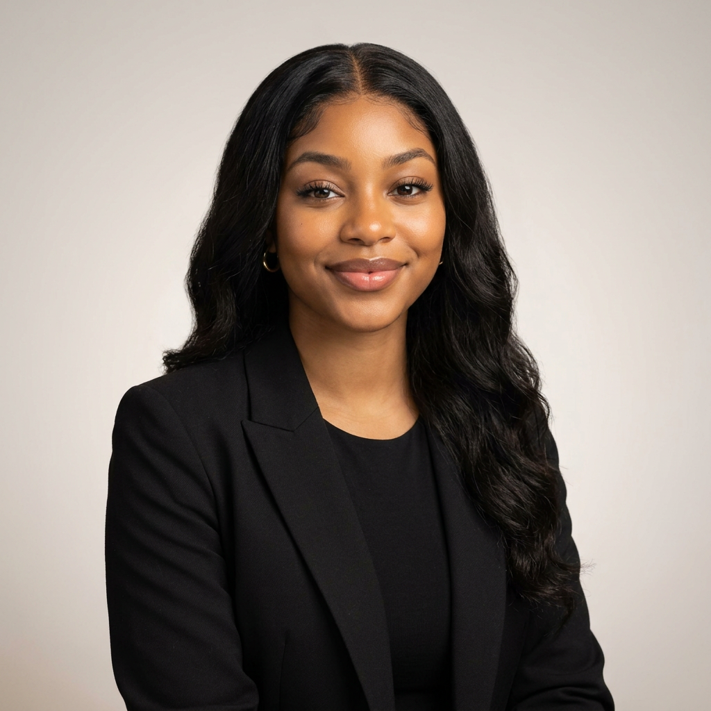
Mira · Founder & CEO, E8 Digital
04 · The Creative Mind
I'm a graphic designer with a strategist's brain. I love finding the clearest, strongest way to say something visually, then carrying that thinking all the way to the final pixel.
05 · The Close
Whether you need a designer to bring an idea to life or a strategist to help shape the direction, pull up a chair. Let's make the work count.